AWS Lambda Geospatial Ingestion — WFP HDC Platform.
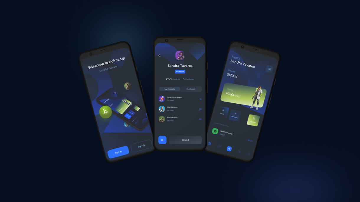
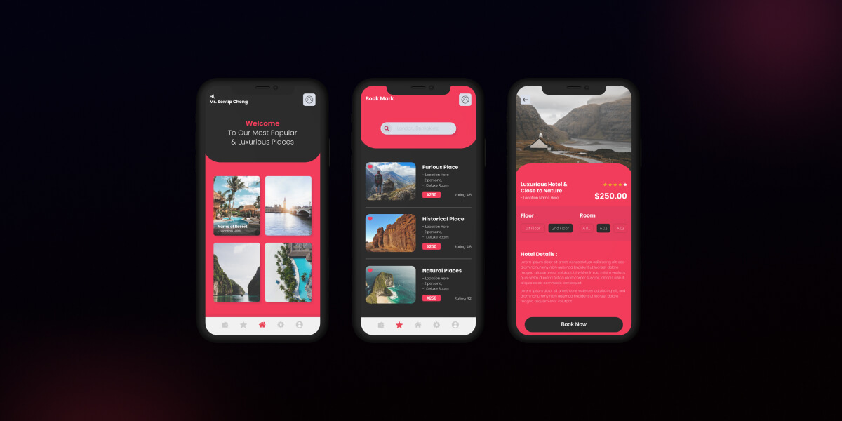
Through a wide variety of mobile applications, we’ve developed a unique visual system and strategy that can be applied across the spectrum of available applications.
I build AI and data systems that solve real problems — from flood forecasting models protecting communities in Rwanda, to data infrastructure for organizations across Africa. Currently at the WFP Innovation Accelerator in Munich, and building in public through personal initiatives.
Designing and fine-tuning machine learning systems for early warning and disaster response — including flood forecasting models used by government agencies and UN partners.
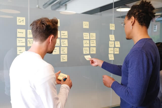
Building modular, production-grade data pipelines that ingest, clean, and structure messy real-world data (hydrological, agricultural, operational) into formats models can actually use.

Helping businesses turn scattered spreadsheets and manual processes into structured, automated Airtable systems — from inventory to client workflows.

Translating complex data and AI concepts into content and narratives that non-technical audiences — and African audiences specifically — can understand and act on.

Working across governments, UN agencies, universities, and tech companies (Google, Oxford, Los Alamos National Laboratory) to deliver AI systems that survive contact with the real world.

Sharing lessons from building AI in low-resource, high-stakes environments — most recently at UN 2.0 on AI-driven workflow innovation.
Through a wide variety of mobile applications, we’ve developed a unique visual system and strategy that can be applied across the spectrum of available applications.
Meta:
Short description: An interactive dashboard for exploring Rwanda’s hydrological gauge network — built to make a dense dataset visually explorable for the flood forecasting team.
Full body: Behind any flood forecasting model sits a network of physical gauges collecting river discharge data — and understanding what that network actually looks like, where gauges are, and what data they’re producing, is harder than it should be from raw spreadsheets. I built an interactive HTML gauge explorer dashboard as a supporting tool for the Rwanda Flood Forecasting project, giving the team a visual, explorable interface into Rwanda’s hydrological monitoring network.
It’s a smaller build than the core forecasting model, but the kind of tool that makes a large technical project usable day-to-day by people who aren’t going to read raw CSVs.
Through a wide variety of mobile applications, we’ve developed a unique visual system and strategy that can be applied across the spectrum of available applications.
Meta:
Short description: A one-stop digital platform consolidating humanitarian program data across North-Eastern Kenya, built to help county governments make faster, better-informed decisions.
Full body: North-Eastern Kenya has no shortage of humanitarian and development activity — the problem was visibility. Multiple organizations were running programs with little shared information about who was doing what, where, and with what results. This project built a digital data platform to consolidate that information into a single, accessible portal.
Beyond the platform itself, I led development of county-level dashboards that let local governments see program activity in their area and make more informed decisions, and provided technical oversight for testing predictive analytics tools designed to forecast political violence — a genuinely difficult, high-stakes modeling problem given how sparse and sensitive the underlying data is. Alongside the technical build, I worked on the governance side: designing MoUs between county governments and civil society organizations to formalize data sharing, and establishing information exchange channels involving the Office of the Deputy President and the North East Advisory Group.
Through a wide variety of mobile applications, we’ve developed a unique visual system and strategy that can be applied across the spectrum of available applications.
Meta:
Short description: A machine learning tool that tells farmers in Tanzania whether fertilizer or alternative agronomic practices will actually improve their crop yield.
Full body: Fertilizer isn’t always the right answer — sometimes better agronomic practice does more for yield, and getting that recommendation wrong costs farmers money and effort. Using agronomic survey data from Babati District, Tanzania, I built an interactive machine learning tool that predicts whether a farmer should apply fertilizer or adjust practices instead.
The build was full-stack: a Django backend serving the ML model’s predictions, a React frontend farmers and field staff could actually use, and a PostgreSQL database I designed to support it, complete with API endpoints connecting the two layers. It’s a small-scope project by budget, but a clean example of taking a model from research question to something a non-technical end user can open and act on.


Through a wide variety of mobile applications, we’ve developed a unique visual system and strategy that can be applied across the spectrum of available applications.
Meta:
Short description: A panel discussion on how AI is reshaping humanitarian workflows, drawing on real, in-progress lessons from the Rwanda Flood Forecasting project.
Full body: Invited to speak on a panel at a UN 2.0 event focused on AI-driven innovation in humanitarian workflows, representing the WFP Innovation Accelerator’s work on the Rwanda Flood Forecasting System. The conversation centered on what it actually takes to bring AI systems into humanitarian operations — the partnership complexity, the data quality problems nobody warns you about, and where AI genuinely changes outcomes versus where it’s overhyped.


The training provided by university in order to prepare people to work in various sectors of the economy or areas of culture.
Livingstone brought a rare mix of technical depth and patience to a genuinely difficult problem — turning inconsistent hydrological data into something a model could actually learn from. He didn't just write the pipeline; he understood why the data was broken and fixed it at the source. That kind of diagnostic thinking is what got this project unstuck.
We came to Livingstone with a mess — data scattered across spreadsheets, no single source of truth. What he handed back wasn't just a database, it was a system our team could actually maintain without him. That's the difference between a consultant and someone who solves your problem for good. hendrerit ante. Ut tincidunt est ac dolor aliquam sodales phasellus smauris
I've worked with a lot of data managers, and few combine regulatory rigor with the ability to actually lead a team under pressure. Livingstone ran our data operations with a level of discipline that held up to FDA and ICH scrutiny, while still being the person the whole team trusted when something went wrong.
Last night, Arsenal won the Premier League for the first time in 22 years.
I am a Gooner. Have been since I was a kid in western Kenya, watching grainy replays of Thierry Henry glide past defenders like they weren’t there. For many of us who grew up in Africa, Arsenal wasn’t just a football club. It was a feeling. A way of seeing the world.
But today I’m not writing as a fan. I’m writing as a data person. And the data behind this club tells a story that goes far beyond football.
Let me start with the season just won.

Arsenal conceded only 26 goals all season. The fewest in the league. Their goalkeeper, David Raya, kept 19 clean sheets. But what strikes me most isn’t that number. It’s what it represents: a team that decided the most reliable path to winning was making it almost impossible to lose. They didn’t dazzle every week. They were just relentlessly, quietly, difficult to beat..
Since 2022, Arsenal spent 562 days at the top of the Premier League table — more than any other club. For three years in a row, they finished second. The trophy kept escaping them. But they never left the top.
That is not bad luck. That is character. And eventually, character converts.
Now here is where it gets interesting for me as a data person.
Arsenal have an estimated 100 million fans worldwide. Indonesia and the USA each generate roughly 9% of their global search traffic. Brazil contributes 6%. And Africa? Africa is woven through this club in ways that rarely get spoken about.
Aliko Dangote — the wealthiest person on the African continent, worth over $30 billion — has been publicly trying to buy this club for years. Khaligraph Jones, Kenya’s most prominent rapper, literally rapped about Arsenal in a hit song. Raila Odinga was a Gooner. Paul Kagame is a Gooner. The current UK Prime Minister gifted Arsenal merchandise to a sitting US President as one of his first diplomatic acts in office.
Arsenal’s fanbase includes a sitting head of government, Africa’s richest person, a 7× Formula 1 world champion, a reigning NBA champion, and four Oscar-winning actors. This is not a coincidence.
I want to sit with that for a moment.
We live in a world where people constantly debate what it means to belong. Where you grew up. Which passport you carry. Which language you think in. But 100 million people, from Lagos to Jakarta to Rio to Munich, woke up this morning connected by the same red shirt.
Here is what the data is actually saying, if you look past the numbers:
Arsenal are the most hated fanbase in the Premier League right now — 43% negative sentiment online, the joint highest in the division. Meanwhile Manchester City, who face 115 alleged financial rule breaches, sit at just 25%.
You know what that tells me? We are hated because we are present. Because we refuse to be quiet. Because we kept showing up at the top of the table for three years with nothing to show for it, and still believed.
Hate is data too. It tells you who people feel threatened by.
I work in data every day — building AI systems to predict floods, estimate crop yields, understand where hunger is heading before it arrives. And one thing this work has taught me is that the most important data is not always the numbers themselves. It is the story the numbers are trying to tell.
Arsenal’s story is this:
Stay consistent long enough and the results catch up. Build something that people across cultures and continents feel belonging to, and you have something that lasts. Be so good — and so present — that even the people who hate you cannot ignore you.
That is not just a football philosophy. That is a life one.
22 years. 562 days at the top. 100 million people.
We are home.
— A Gooner from Kenya, writing from Munich 🔴
#Arsenal #PremierLeague #DataStorytelling #Football #Leadership #Africa #COYG
Every evening, on the train from work, my mind doesn’t switch off.
Munich moves past the window — commuters, lights, quiet conversations — and I’m somewhere else entirely. Thinking about DATA.
Not the CODE. Not the MODELS. The PEOPLE around them.
I’ve spent years building data systems for some of the world’s most complex problems — Child Mortality Prediction, flood forecasting, food security, and agricultural risk in the world , East and Central Africa. And somewhere along the way, I noticed a pattern.
The projects that failed rarely failed because of bad data.
They failed because someone didn’t believe in its value.
A department head who saw data sharing as losing control.
A team that had been burned before and wasn’t ready to trust again.
A brilliant engineer who spoke only in technical terms to people who needed plain language.
I’ve sat in those meetings. I’ve watched a room full of intelligent people talk past each other — not because they disagreed on the destination, but because nobody had built a bridge between what the data could do and what the business actually needed to hear.
Data is only as powerful as the humans willing to act on it.
The cleaning, the engineering, the modelling — those are skills you can learn. What’s harder to teach is the ability to walk into a room of sceptics and bring them along.
That’s the work nobody talks about.
What’s the most human challenge you’ve faced in a data project? I’d love to hear it.

A few months ago, I was tasked with designing a Data Sharing Framework for a complex project that brought together government officials, private sector players, and humanitarian stakeholders.
At first, it felt overwhelming—so many actors, so much data, and so many expectations. But as I went through the process, I began to see patterns and lessons that made the work not just possible, but impactful..

Here are the biggest lessons I learned that I believe anyone can apply when building a framework for data collaboration:
🔹 1. Begin with clarity of purpose
I learned that you can’t design a framework in a vacuum. Start by asking: What is the project trying to achieve? What data is truly needed? Once the objectives are clear, everything else starts to align.
🔹 2. Stakeholder mapping is non-negotiable
Before the first meeting, I created a detailed map of all stakeholders—who they are, what they bring to the table, and where their influence lies.
🔹 3. Data quality and security come first
In an era where data privacy is a hot topic, I quickly realized that trust hinges on how well you handle data quality and security. Without strong safeguards, no framework will survive stakeholder scrutiny.
🔹 4. Understand what data really means
It wasn’t enough to say “we’ll share data.” I had to break it down: Are we talking about personal identifiable information? Aggregated stats? Operational data? Knowing who holds what and how it has been shared before was key.
🔹 5. Capture stakeholder needs early
I made it a priority to listen—really listen—to what stakeholders needed from the framework. Some wanted visibility, others wanted safeguards, and a few wanted both.
🔹 6. Always bring a draft to the table
One mistake I avoided: calling a meeting with no draft. By sharing an initial framework early, I gave stakeholders something concrete to react to.
🔹 7. Co-create, don’t dictate
During workshops, I shifted from “presenting” to “co-creating.” I asked guiding questions, facilitated group discussions, and made sure every voice was heard. That’s when the framework started to feel like ours, not mine.
🔹 8. Transparency builds trust
The more I explained every element of the framework, the more open stakeholders became. Transparency created room for tough questions.
🔹 9. Decide on the legal angle early
One key decision was whether the framework should be legally binding or serve as a reference guide. Getting clarity on this upfront prevented confusion later.
🔹 10. Train and empower champions
After the framework was approved, I worked with stakeholders to identify champions who would train their teams. That step was essential to moving from “document on paper” to “culture in practice.”
💡 My takeaway:
A Data Sharing Framework isn’t just about systems and protocols—it’s about people.
👉 If you’ve ever been part of building or using a data sharing framework, what lessons stood out for you?
Whether it's a data system that needs structure, an AI project that needs grounding in reality, or a stage that needs someone who's actually shipped this stuff — I'd love to hear from you.
Email: livingmumelo@gmail.comHello